Easy tips to make an amateurish store look professional.

Hello. My name is Ujita, and I am a consultant.
I tried to create a store, but it just doesn't look right...
If you have such problems, this is a must!
Even the author, who does not know much about coding, was able to launch a cross-border e-commerceon Shopify. In this article, I will show you some of the most overlooked points to make your Shopify store look professional.
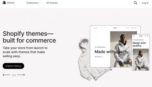
Shopify's extensive templates
Shopify offers 12 free templates and 126 paid templates.
You can find templates for those with a small number of products or for different product categories.
For example, if you have 1-3 products and want to highlight reviews,startup, whisk, Launchand others are recommended. These templates are good at providing a detailed description of the product.
Free templates,Refreshis also recommended. Although the free templates have fairly sophisticated designs, paid themes are still recommended for inexperienced coders in terms of fonts, color variations, and variety of sections.
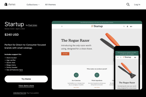
Click here for a list of Shopify themes!
Once you've applied the template, there's one more thing to do!
The product registration is done, all the necessary images are registered, and the text is ready. But it looks somewhat amateurish.
If this is the case, you can easily make it look more professional by simply following a few key points! Here are a few important points to keep in mind.
- Images should be of good quality.
The impression KV's images make when you open your store will directly affect the level of trust your customers have in your store. Use the highest quality images possible.
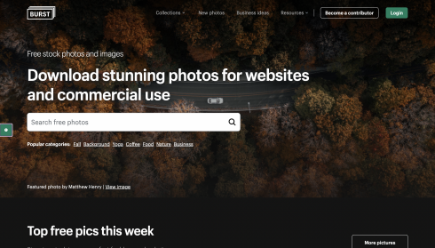
The free images that appear in the Image Insert field of the Store Editor are provided by Shopify.BurstIt is provided by an image site called We recommend this site for its many stylish images.
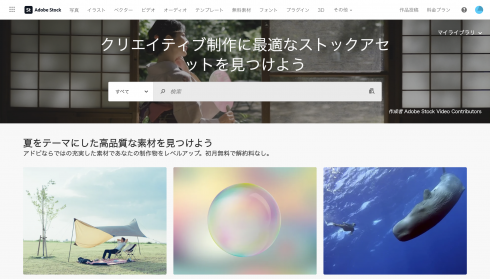
If you can't find your favorite image in Burst,Adobe Stockis recommended; Adobe Stock also offers monthly plans that allow you to get fairly high quality images for about $260 per image. If you get a regular license, you can also post them on e-commercefor your use, which is safe.
- Unify store colors
Color consistency is important for design consistency.
For a clean store, it may be a good idea to choose one accent color with white as the base color, then decide on a lighter color in the same family as the accent color, or another lighter color such as gray, to bring the colors down to about three colors. A variation of colors will make it look uncoordinated and cause it to look amateurish. - Changing the background color for each section
Changing the background color for each section can add depth and dimension to the design. Using too many colors can be confusing, so keep it to about three colors: white (or black), gray, and an accent color to achieve balance. - Align no more than two fonts.
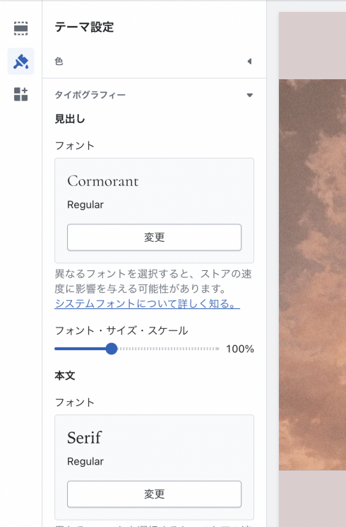
Consistent fonts are also important for design consistency. You can choose a stylish font for headings from the editor's font selection screen (typography). Using a distinctive font for headings and a uniformly simple font for body text can create a professional design feel.
Adjustment points for smartphone size display
For those of you who are thinking, "I tried the above points and the store looks pretty good! But when I put it on the smart phone screen, it suddenly looks uncool..." For those of you who are not familiar with the above points, here is an explanation of the key points.
- Description is too long
Is the description in one section too long? When viewing the site on a smartphone, the site looks like a dissertation if there is a long line of text on one screen. In order to keep customers from getting bored while looking at the site, it is important to show the site in a way that it has movement by including various images, colors, and headings.
The more thought you put into your product, the less you want to leave out the description. Try inserting headings as appropriate in the text, interspersing images, using different sections, and changing the background color. - KV images should be compatible with smartphone size
I've heard of responsive design, but I don't know what it is...
I don't want to mess with the code and break the site...
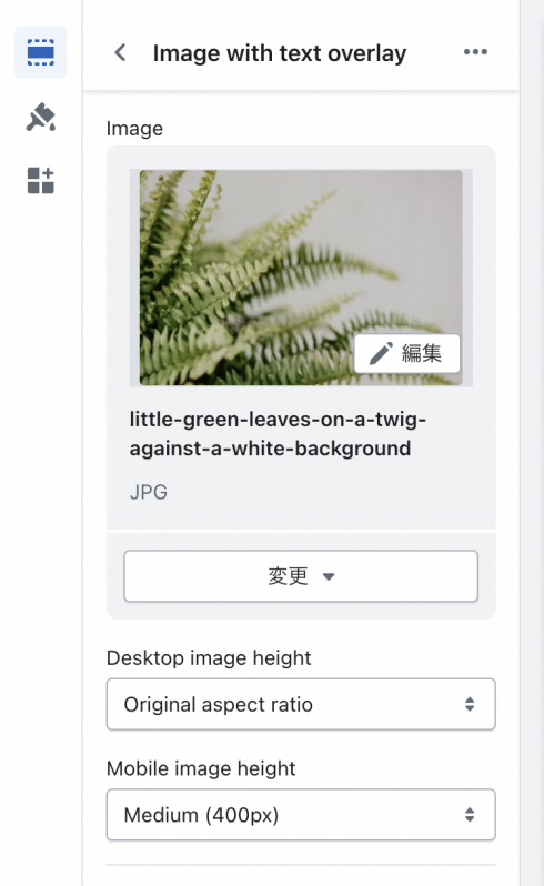
If so, you can easily make it responsive with a single click from the store editor. If your KV images look somewhat small when you open the store on your mobile phone, try using the "mobile image height" button in the editor.
This button is contained within each section. In the image below, the section called "image with text overlay" is used.
Easy coding with custom CSS
What is custom CSS?
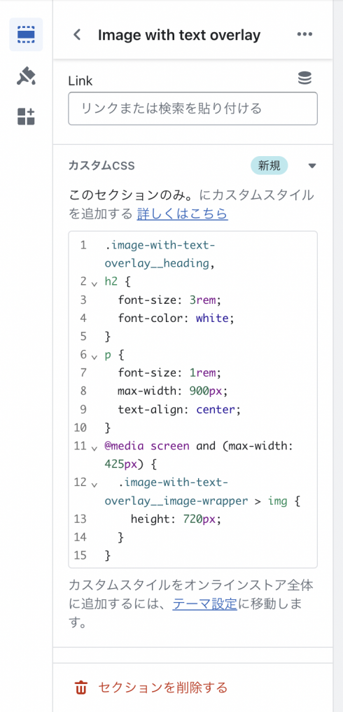
Custom CSS is a feature that allows you to make coding modifications only to the section in question. Select the section you wish to make changes to in the editor and scroll down to the bottom to see the Custom CSS area.
Within this area, you can easily apply styles by writing CSS code to adjust font size and margins.
Adjusting fonts and margins requires a bit of coding knowledge, but all small modifications can be handled by copying and pasting, so even coding beginners are encouraged to try it out.
- Make the font smaller
With the default settings, the font may be quite large when viewed on a smartphone screen. Simply adjusting the font size can change the look considerably!
Changing font size requires a bit of coding knowledge.
But don't worry. Using a feature called Custom CSS, you can easily change the size without having to search through Shopify's massive code files. - Adjusting Margins
Are the line spacing between headings and body text too narrow, or the width of the text too narrow? Are the gaps too saturated, the line spacing too tight, or the text too centered or left-aligned?
It's just a small detail, but just a little tweaking can make a big difference in the impression.
Summary
How was it? You don't have to learn web design from scratch or learn difficult coding to change the look and feel of your store.
When choosing a Shopify template, choose from a wide variety to suit your needs. Maintain design consistency by using high-quality images, using uniform colors, and changing the background color for each section. In addition, unify no more than two fonts to create a professional design feel.
On mobile phone screens, descriptions may be too long or KV images may not be appropriately sized. So, improve readability by separating descriptions with headings or images and changing the background color. It is also important to adapt KV images to smartphone sizes.
In addition, custom CSS can be used to adjust font size and margins. Even coding novices can easily modify the relevant areas and apply their own preferred style.
By following these pointers, you can achieve a professionally designed store. Please give it a try!
Achieve results with "minimum investment and effort.
Cross-border e-commerceOne-stop shop for services

